Finding common ground
A wealth of principles
Helping BNY Mellon achieve a consistent brand experience with multiple digital properties across a number of geographical territories.

Client
BNY Mellon
Responsibilities
User Research
Content Development
Visual Design
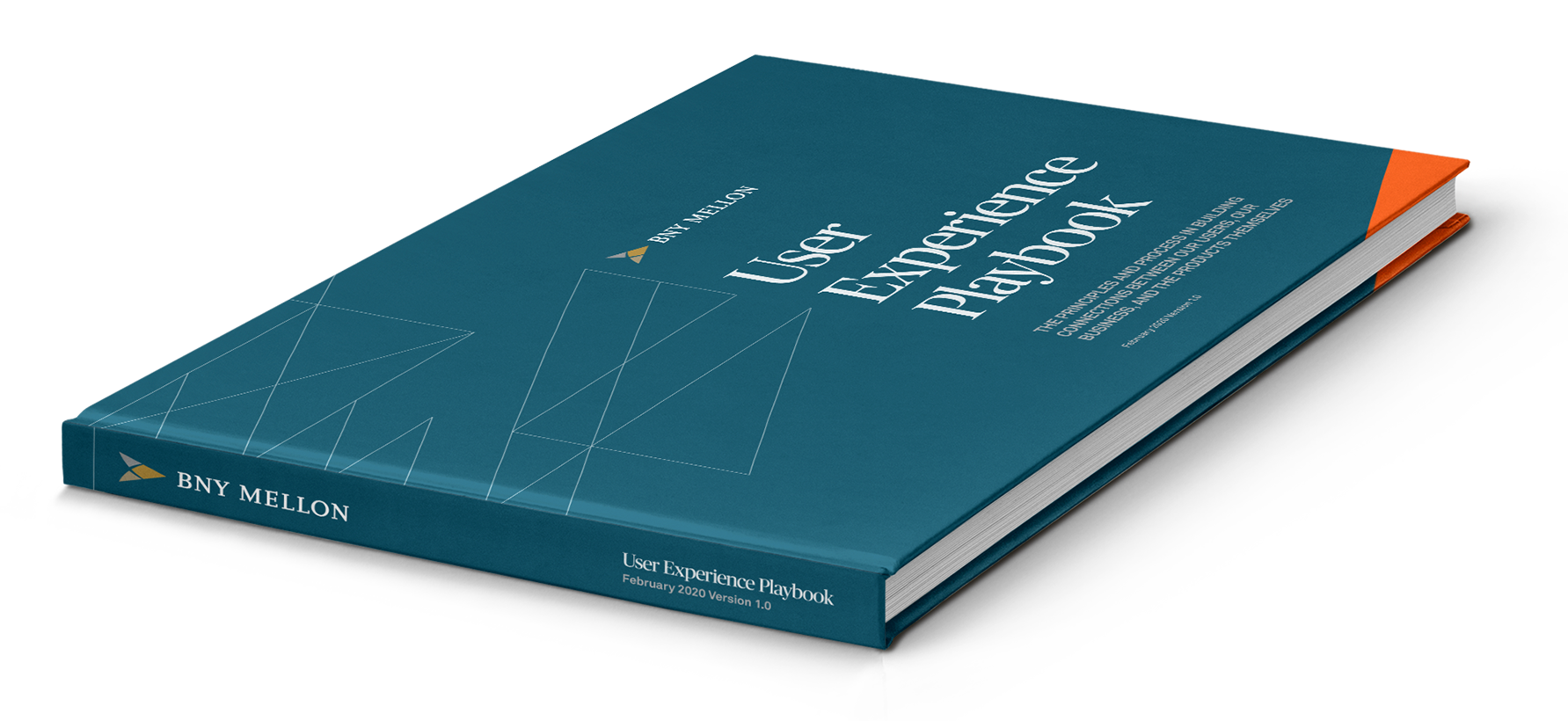
BNY Mellon faced a fundamental challenge when it came to their internal UX and UI guidelines—they had not established a unifying structure across their multiple platforms that their digital teams could turn to as a guide and that presented a consistent brand experience for users.
Simple steps
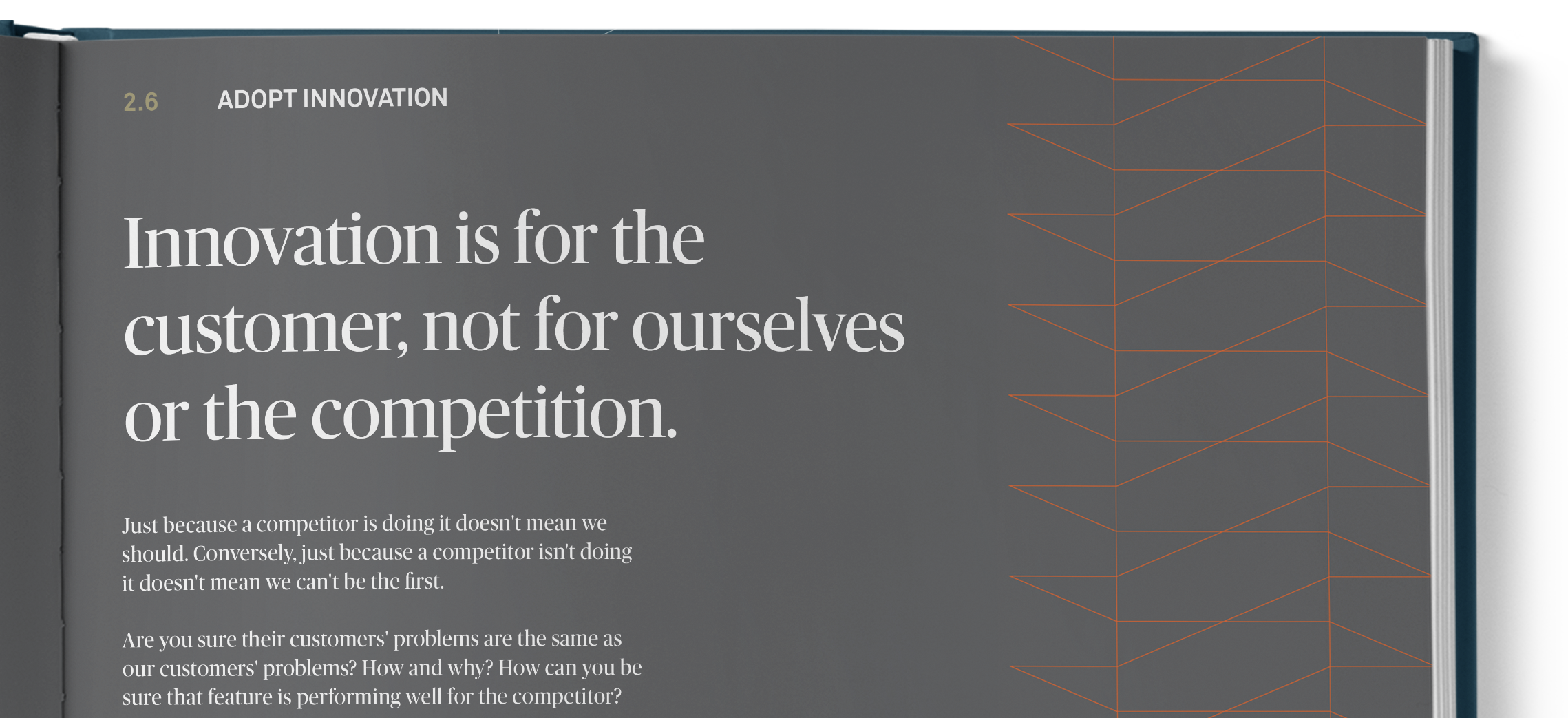
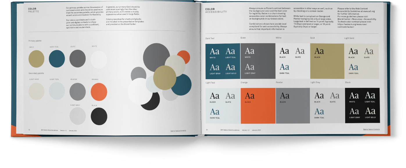
First and foremost, the document needed to be practical (an authoritative source of information), but it also needed to be visually appealing to inspire use among the various stakeholder groups.


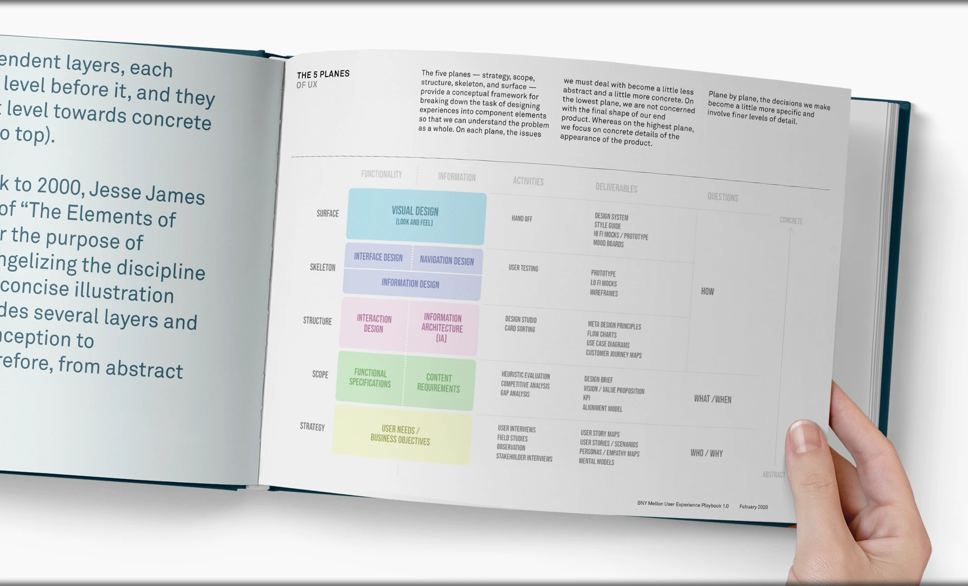
The guidelines document all of BNY Mellon’s online assets, providing scenarios of when to use a given asset and the format required. UX rules cover areas including image ratios, CTA buttons, iconography, text links, card modules, and responsive layouts, and consider both desktop and mobile environments.

Effective Results
The solution was a simple UX document that gave their digital team and partners a consistent UX framework that adheres to their brand best practice.
More stories coming!
I just started posting my work to Storyboardi.ng a few weeks ago (June 2023), and I still have much to do. You can view some additional work by downloading the PDF below.
Case Studies